The Funny Power of Paint Color Names
There are a lot of things that go into choosing a paint color. The best way to do it is get a lot of samples and start eliminating ones you don’t like. But here I want to discuss one thing that you don’t want to think about when you are picking a paint color: the name!
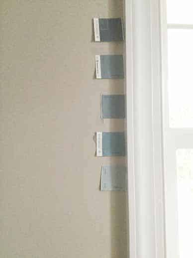
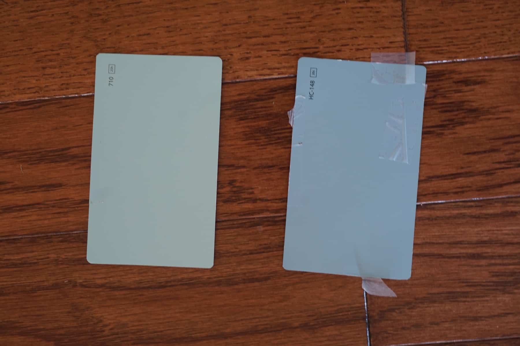
Since I am searching for a paint color for my dining room, I have entered the strange internet world of paint color discussions. There is a lot of obsessing and not a lot of actual information. Photographs do not accurately portray colors at all, and descriptions are fairly useless. These are facts that everyone knows but no one can accept. I am endlessly searching for real life pictures of colors I am interested in, just to find that they all look totally different from each other and from the paint chip. Natural light vs artificial light, the time of day, and countless other factors make online pictures not very helpful.
Why do we get “attached” to certain paint colors?
But an odd thing that I’ve noticed myself doing is latching onto a color I have read about and wanting it to work in my room. This, my friends, is an example of good marketing. A consumer being attracted to something and deciding it is “them”, having it take hold in their mind, and finally making them want to buy it.
Heirloom Homemaker Email Course
You’ll get one email a day with an actionable plan to get a handle on your home routines. No overwhelm.
Over 5600 women have loved this mini course. Unsubscribe at any time
And what is so powerful about certain colors that they appeal to me when I haven’t even seen what they look like? The name.
Isn’t that totally absurd? Here are some names that I think express my inner self: Kensington Blue, Homestead Green, Jamestown Blue. I guess I am a colonist, in some type of elegant plantation home, or maybe just the owner of a British estate. There are similar colors called Del Mar Blue and Scenic Drive, but those names don’t work for me.
Why do manufacturers spend so much energy on naming paint colors?
Here are some other good ones from Benjamin Moore: Collingwood, Edgecomb Gray, Heritage Red, Hale Navy. What’s interesting about these names is that they aren’t terribly descriptive. I read an article about named paint colors, and the “namer” said that they are always looking for descriptive names, like foods. The example given was strawberry parfait because everyone can picture what that color will be. A lie, or just bad marketing. The best color names don’t describe, they evoke.
When we painted the nursery I had picked out a beautiful soft yellow called Windham Cream. My husband took it to Lowe’s and found that it matched, pretty much exactly, a color Lilting Lily. Now that name is okay. But I had the name Windham Cream in my mind and I have never loved the color since. Lilting Lily is just not the same feel. It does not say British country house.
Sherwin Williams is abysmal at naming colors. Our builder uses Sherwin Williams and we were allowed to pick a grand total of one color for every wall in the house. I wanted a linen-looking neutral that would look good with white or gray, not too cold but not too warm. What fit the bill was Accessible Beige, a grayed down beige. That name though, is terrible. Agreeable Gray, a similar color but a little cooler, is more popular probably because it sounds more appealing.
They have a few other colors that are pretty with awful names. Livable green, a beautiful shade I want to paint my girls’ room. Hate the name. I also like the beige/ gray/ green tones of Techno Gray and… get this….Chat Room. No.
So to cure my discontent over Accessible Beige, I have renamed it in my mind. (This is totally insane.) It is very close to a Benjamin Moore color called York Gray. Now that works for me. Even better, it’s part of the Williamsburg Collection. Perfect. I like it better now, and that is the sad truth.
By the way, I starting painting my dining room. It’s Woodlawn Blue, and the color looks beautiful so far. Even the butler agrees.


As a color designer (for one of the brands mentioned in the post) I give this article (and these colors) the seal of approval! Accessible Beige is my most suggested color because it adapts so well with everything!
Ooooh, interesting! I wish I could go behind the scenes of the paint color decisions. An interesting blend of science and emotion. I just love color.
Thanks for the laugh. I so resonated with what you said. The names are so alluring. Or not! We make design choices based on more than just our physical senses don’t we!
Very true. Or else the marketing industry would not exist.
Hahaha laughing out loud over here! I have a weakness for heroine thought- provoking names. When we painted our home I can’t even remember the name but my mother in law was appalled. She asked astonishingly, ” White? Stark, sterile white?” I replied, ” No, it is warm white with gray undertones.” In my defense, I could see the gray when I was rolling out the paint unto the walls. I wanted a clean white because we have dark colonial type of furniture of leather and dark woods and I wanted it to pop and it does. It is funny how we get stuck on names. I love paint and lipgloss names. I say rename it whatever you feel! Your home, your rules. But I agree with the great marketing minds.
White is so beautiful as a wall color, I think. I bet it looks great in your house, especially if it’s a warm white. But how could you forget the name? ????
Thank You! It does, my MIL still disagrees but it makes my heart sing! Lol I know right?? The name, I will rename it to Cordelia’s Courage.
I love the name of a shade of lipstick just because it makes me feel like a heroine in a novel about the London Blitz.
“Accessible Beige” is appalling. Why not just call it “Institutional Ecru” and get it over with?!
I’m going to need to hear the name of that lipstick shade!
L’Oréal British Red. My husband is less enthused, unfortunately.
Ha! ????
My two teen girls are getting their rooms repainted this summer and I allowed them to pick the colors. It’s been interesting seeing them choose colors based solely on the names. Perfectly lovely colors were passed over strictly because the name is too boring or old-fashioned sounding and some perfectly wretched colors (IMO) were being considered because the name appealed to them. In the end though, when it came time to finally make a commitment one picked a sensible and pretty neutral “nearly peach” and the other picked an equally sensible and soothing “just blue” because it’s very close to the same color grandma has in her room and she loves grandma’s room. I feel as though I dodged a bullet though. It could have turned out much worse. lol.
So funny. My little ones like a color called Posy, the name of one their cats. The brainwashing starts early! ????
I have always said that the companies lock people in a little windowless room for extended periods to come up with paint names! Some of them have nothing to do with the color! Okay that guy just wanted out of the room!
Seriously. It is a weird, weird thing all around. ????
They don’t lock us in anywhere haha but really how many ways can you describe a gray or brown