Afraid of picking paint colors? Tired of beige? Then the Benjamin Moore Historical Collection is exactly what you need.
I love every single color in this collection and have used it personally in so many rooms of our room. I’ve also rounded up some favorites that I haven’t used but that I love.
Word to the wise: These color names are weird. Things named ivory are bright yellow. Colors called green are blue. Be careful when you make your choice!

Whether you’re a history buff, a color enthusiast, or someone simply looking to infuse your home with a touch of classic charm, these hues are guaranteed to elevate your decor.
The most popular colors in the collection
These colors are popular for being classic and versatile. Of course, trends change, and popular doesn’t always mean it’s the best for your home.

- Hale Navy (HC-154): A deeply saturated navy blue that is versatile and timeless, perfect for both exteriors and accents.
- Revere Pewter (HC-172): A light gray with warm undertones, it has been a go-to neutral for various spaces.
- Palladian Blue (HC-144): A soft, dreamy blue with a hint of green that evokes the classic look of old Palladian architecture.
- Wythe Blue (HC-143): This is a serene and soothing blue-green that works well in bedrooms and bathrooms for a spa-like feel.
- Edgecomb Gray (HC-173): A soft, warm gray that acts as a neutral backdrop for a variety of decorating styles.
- Beacon Hill Damask (HC-2): A historical and elegant green with golden undertones, lending a refined look to any room.
Whole House Paint Colors (whites and Neutral)
Many people love the idea of a whole house paint color, which is usually a neutral that can used in every room of the house.

But if you are looking for an authentic historic look, neither gray nor beige is really quite right. Go for a white or an ivory.
Revere Pewter is internet famous and became uber-popular when the greige trend hit. It can. be beautiful in some lights, but it has a lot of gray. Be careful if you’re using it in low light!
For something a little warmer, try York Gray.
Other beautiful, historical neutrals:
- Lancaster Whitewash (see it in this beautiful home office from Content in a Cottage)
- Wickham Gray
- Edgecomb Gray
- Elmira White
Even a very warm cream that looks a little yellow is a very good choice for a warm, happy feel to your home.
Historical Collection Blues
Blues and greens are a popular choice when you’re looking for move beyond neutrals. And lucky us, this collection has some of the best.
Most of these shades are beautiful blends of gray, green, and blue. This makes them subtle and gorgeous, but it makes them hard to choose! They all change dramatically with the light. And, as I’ve mentioned, their names are super confusing. Physical samples are a must with these colors.

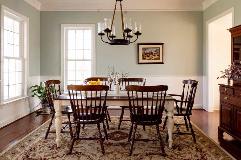
My dining room is Woodlawn Blue, and I love it there. But I think it would be pretty in a master bedroom as well, and even a living room. It pairs very well with red or navy, which keeps it from looking like it belongs in a beach house.
If you have a room without a lot of light, blue is usually not a good choice, especially a gray blue. But in this collection, many of the blue have so much warmth to them that they work in dark rooms, and enough gray to keep them muted.
Other blues with gray and a little warmth to them:
- Jamestown Blue (seen here in a bathroom)
- Wythe Blue
- Templeton Gray (looks blue in a room)
- Newburg Green (a warm navy)
- Hale Navy (a true navy)
The best Benjamin Moore greens:
This paint color collection is loaded with gray-greens that straddle the line between neutral and color. They are some of my favorite colors in the whole world, and they work for walls, exteriors, cabinets, and anything else.

My guest room is Guilford Green, which is my favorite in this family. My parents liked it so much that they painted their living this color too. It is perfect for those of us who are tired of beige and gray but still want something that feels neutral.
The best warm, grayish greens in the historical collection are:
- Louisberg Green
- Saybrook Sage
- Providence Olive (very neutral, barely green)
- Guilford Green
- Nantucket Gray (can look gray or green depending on the light)

Reds, Pinks, and Yellows:
Most people will use these as accent colors (except for a very pale yellow, which can be a great neutral). These are the warmest of paint colors and add life to a house. They are perfect for a room that can be closed off, such as a dining room, bedroom, or more formal sitting area.

Any room tucked away will feel like a warm and cozy hideaway in one of these warm colors. My older girl’s bedroom is Queen Anne Pink, and it is cozy and beautiful, but I would not want a main living space in that color.
Be very careful when picking yellow or pink- you want something that looks very dull on the chip and barely colorful at all. The color will intensify and reflect on itself in a room. Luckily, this paint color collection has many muted yellows that are beautiful.
Deep reds are beautiful and historically accurate, but can be overpowering. They look good in rooms without a lot of direct sunlight, since they will help to warm it up. They also work in rooms with a lot of white trim or paneling to help balance them out.
Some of the best Benjamin Moore yellows, pinks, and red are:
- Weston Flax (muted yellow)
- Philadelphia Cream (golden light yellow)
- Queen Anne Pink (warm pink)
- Odessa Pink (dusty pink)
- Georgian Brick (warm deep red)
- Country Redwood (true deep red)
Using other brands
Color matching between brands is hit or miss. Sometimes a really subtle difference in the formula will result in a big difference in the room. If you don’t want to ask a paint company to match a Benjamin Moore color for you, there are other options.
This free online color comparison tool will give you color names in different brands that compare to your desired color.
You can also order Benjamin Moore paint directly from them. Here is their shipping policy.
General tips for choosing your historical paint colors
- Make a selection of many colors, and then start eliminating.
For some reason, it is much easier to see a color’s true nature when comparing it to something else. You can tell that one blue is too gray, one is too green, and one is just right. Internet research is helpful, but there’s nothing like having a paint chip in your hand. I have the Benjamin Moore Fan deck (the classic collection has all the historical collection colors in it as well), and it has saved me many times.
2. Don’t let the name sway you
This is true when you are picking any paint color. But it’s especially true with Benjamin Moore and with this specific collection. It’s madness. Don’t let crazy paint names get you.
3. Keep the light in mind
This is important for every paint color, but particularly for this collection! The amount of gray in each shade can look elegant in one room–and downright depressing in another.
- Natural Light:
- The direction of Light: North-facing light is cooler and can make colors look bluer, while south-facing light is stronger and brighter, often intensifying colors. (Eastern exposures will act like Northern exposures in the evening, and vice-versa.)
- Weather Conditions: Overcast days can diffuse natural light, making colors appear flatter, while sunny days can increase contrast and saturation.
- Artificial Light:
- Bulb Type: Incandescent bulbs emit a warm, yellowish light that can warm up colors, while fluorescent lighting is cooler and can give colors a bluish tinge.
- LEDs: LED lights come in various color temperatures, affecting the color perception; warm LEDs can mimic incandescent light, while cool LEDs resemble daylight.
- Dimmers: The use of dimmers can change the intensity of the light, which can in turn soften or intensify the perceived color.
That’s it!
There are under 200 colors in the Historical Collection, and almost all of them are good. I listed out my favorites, but I love nearly all of them. I hope this guide has helped you see some real-life examples and inspired you to add some color to your home.
I believe in decorating over time, so don’t rush. Every time I’ve hurried to pick a paint color it has not gone well. Take the time to research, get samples, and then decide.